An exciting journey through various abstract landscapes
According to Arntson (2013), «…a designer needs a command of both graphic design principles and concepts and related digital techniques» (p16).
As I wanted to gain as much knowledge and ideas as possible to improve my graphic design skills for my Practice 1 (both principles and concepts and digital techniques), I aimed towards creating blog entries that were complementary to my previous Annotated Bibliography and Critical Analysis. Part of my blog research strategy was also to have a flexible and open approach and to get the flavour of the latest trends in graphic design. Through my research on the reactions and thoughts given to newly released graphic design it also became clearer to me that even if you are asked to create something entirely new, you must never neglect the connections to the past.
Interestingly, through my research I found plenty of new design that could be routed to art work made by designers or artists in the past. So did I adopt this idea to the process of creating my first trial for Fat 1, where I found inspiration in various constructivist abstract design created by the use of a limited range of shapes, colours and forms (see figs 1A-C below):
-

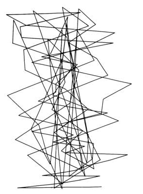
- Fig 1A INSPIRATION Constructivist composition (1923) by László Moholy-Nagy
-
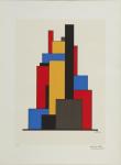
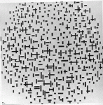
- Fig 1B INSPIRATION Constructivist composition (1923) by Lajos Kassák
-

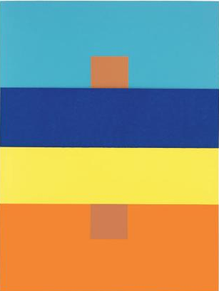
- Fig 1C PRACTICE WORK The Advent Candles (2014) part of Practice 1 by Lykkefugl
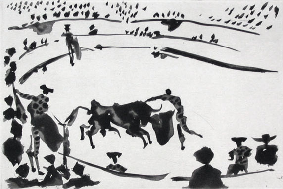
To pay attention to research and findings at the same time as I was in the process of creating, was sometimes a challenge to coordinate. Especially because my Practice 1 outcomes changed so radically over a short period of time, I also struggled to narrow my research topic. I strongly believe, however, that the blog helped me to broaden my horizon and that it encouraged me to find «my destination(s)» in these abstract graphic art landscapes. For example, I found the reading about Josef Albers colour theory of particular great value for my future work, as well as it was very inspiring to read about Picasso’s quasi-abstract work -some which also appeared as book cover design (in combination with photography).
My «destination» and way forward:
To sum up, the whole blog experience has been a skillful journey where I simultaneously tried out a variety of expressions in different abstract styles. I had no idea, that I should end up including photography as part of the process of creating my future graphic art work. Now, greatly inspired by the artist Gerhard Richter’s work (see fig 2), I urge to create more work in a similar style, by scanning my abstract paintings and photos -and eventually work with the different layers digitally. I believe these images could possibly make great album/book covers and be used in a broad graphic design field. By using digital tools such as Gimp and/or Vizzie it is easy to regulate the degree of abstractness as well as I have the opportunity to create various expressions just by the manipulation of colours. Next, I will look into the huge field of typography, and lastly try to create or find the fonts that most perfectly suit these kind of images.

Fig 2 Candle lll (1989) by Gerhard Richter
Word Count: 500
References:
Arntson, A. (2012). Graphic design basics. 6th ed. Boston: Carl Baxter.
Internet sources:
Gerhard-Richter.com (2014) [Homepage] At: https://www.gerhard-richter.com/en/biography/the-1980s-rising-to-international-acclaim-7 (Accessed on 22.12.2014).
Image sources:
Figure 1A: Moholy-Nagy, L. (1923) Constructivist composition [Oil on canvas] At: http://www.artexpertswebsite.com/pages/artists/moholynogy.php (Accessed on 30.12.2014).
Figure 1B: Kassák, L. (1923) Constructivist composition [Silkprint] At: http://pinterauctions.com/constructivist-composition (Accessed on 30.12.2014).
Figure 1C: Lykkefugl (2014) The advent candles (part of FAT 1) [Digital Gimp image].
Figure 2: Richter, G. Candle lll (1989) [Oil on canvas, Catalogue Raisonné: 687-1] At: https://www.gerhard-richter.com/en/art/paintings/photo-paintings/candles-6/abstract-painting-7767/?&p=1&sp=32 (Accessed on 22.12.2014).