
Fig 1: The winning Norwegian bank-note design (2014) by Snøhetta
What has been the hottest news in Norway this week – is the launch of the new graphics on the NORWEGIAN BANKNOTES (see picture above). The theme set out by Norges Bank (the central bank of Norway) was «the sea». Snøhetta graphics and the Oslo based design company Metric systems won the competition among eight other suggestions (click here to see the entrants) (Norges Bank, 2014). By browsing through the entrants you can see how the different graphic artists approached it. The interest organisation for visual communication in Norway, Grafill, has now opened an exhibition showing all designs from the 8 contributors at their gallery in Oslo (exhibition runs until 26th october). Among the finalists, Sinead Moore at money.aol.co.uk, particularly picked out one design that catched her eye; The one created by Aslak Gurholt Rønsen were he had used children drawings on the reverse side of the bank notes (Moore, 2014). I think it was a clever idea, often for people money is an issue (being shortened of money) – I think by having children drawings on it, it makes money a little more informal. As well as it would have a positive effect on those who have a lot of money (and for whatever reason have forgotten to smile). This design could make everyone happy – rich or poor. In the time we live we are all dependent on money in a way or another. In my opinion this was the most radical contribution (see image below).

Fig 2: Alternative Bank note design (2014) by Aslak Gurholt Rønsen
THIS IS WHAT SNØHETTA SAYS ABOUT THEIR WINNING DESIGN:
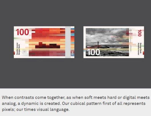
Fig 3: Print screen from Snohetta.com (2014).
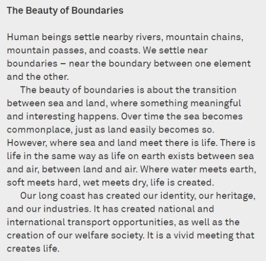
Fig 4: Print screen from Snohetta.com (2014).
As the banknotes function is also to be our Country’s visit card and the graphic design aim to represent the whole population, it has of course been of interest to discuss the actual outcome of it. Some like it and some not. I think the final result became both modern and traditional at the same time. The design has also attracted foreign magazines and newspapers to write their opinions on it (I’ve listed a few links below):
Dezeen Magazine
CreativeReview.co.uk
ABC NEWS
The Atlantic
Gizmodo
CNN
References:
Online sources:
Grafill (Norwegian association for visual art) 2014. [home page] Available at: http://www.grafill.no/nyhet/norges-nye-seddelserie-havet (Accessed on 03.01.2015).
Moore, S. (2014) [Online article published on Oct 11, 2014 in MONEY AOL] Available at: http://money.aol.co.uk/2014/10/11/what-banknotes-would-look-like-if-kids-designed-them/#!slide=aol_3011970 (Accessed on 03.01.2015)
Norges Bank (2014) [Home page] Available at: http://www.norges-bank.no/Upload/Images/Sedler_mynter/nyseddelserie/konkurranse/Norges-Nye-Seddelserie-Havet.pdf (Accessed on 03.01.2015).
Snohetta Brand Design (2014) [Home page] Available at: http://snohetta.com/project/200-norways-new-banknotes (Accessed on 03.01.2015).
Image sources:
Figure 1: Snøhetta design and Metric Systems (2014) The winning Bank note design. [Graphic Design] At: http://www.norges-bank.no/Upload/Images/Sedler_mynter/nyseddelserie/konkurranse/Norges-Nye-Seddelserie-Havet.pdf (Accessed on 03.01.2015).
Figure 2: Rønsen, AG (2014) Alternative Bank note design. [Graphic Design] At: http://www.norges-bank.no/Upload/Images/Sedler_mynter/nyseddelserie/konkurranse/Norges-Nye-Seddelserie-Havet.pdf (Accessed on 03.01.2015).
Figure 3: Snohetta Brand Design and Metric Systems (2014) Norway’s New Banknotes [Print Screen of image and text] At: http://snohetta.com/project/200-norways-new-banknotes (Accessed on 03.01.2015).
Figure 4: Snohetta Brand Design and Metric Systems (2014) Norway’s New Banknotes – the Beauty of Boundaries [Print Screen of text] At: http://snohetta.com/project/200-norways-new-banknotes (Accessed on 03.01.2015).


