Some months back I visited Berlin, a vivid city where tasteful art appeared around every corner. For instance, at Berlin Hauptbahnhof I discovered this colourful advert (see fig 1A) where each type of chocolate was identified with its own colour, which eventually became organised in a way that each colour matched the colour below and above in the vertical row (Fig 1B). Personally I found this advert very powerful and tasty.
- Fig 1A From Berlin Hauptbahnhof
- Fig 1B from Ritter-sport.de
Whether one decide to go for an abstract design art work or not, I believe that to have knowledge about how colours decide the character of the art work would be useful to any graphic designer regardless if he/he makes drawings with a black pencil or creates computer generated graphics – the latter with endless possibilities in terms of colour choices. According to Birren (1976), the study of colours «…has been one of the most intriguing interests of painters since the beginnings of art» (p.105). Birren traces the focus on colour study back to the 14th century painters’ interest in the impact of colour. He further claims the book called «The Principles of the Harmony and Contrast of Colors» (1839) written by M. E Chevreul, who was the director of a large Parisian based tapestry, Gobelin, to be the most important of all books written about colours. The book covers alternate and simultaneous contrast, after images and optical mixtures of colour. What Chevreul wrote about colour harmony still work as the ‘rule’ in today’s colour and art education (Birren, 1976).
Interestingly, Birren, claims that Cubism and the Abstract expressionism have little interest «…in color and favored browns» (p.106). For instance he claims artists such as Kandinsky, Klee, Itten and Moholy-Nagy (all belonging to Bauhaus) to be less attracted to colour science. On the other hand he advocates the work of Hungarian abstract painter Victor Vasarely who became most famous for his abstract work using a minimal number of forms and/or colours (Birren, 1976) (Fig 2).
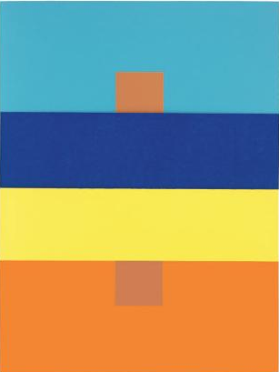
When creating my own art works for my Practice 1, I found it particularly helpful to read what Josef Albers wrote about colours. Albers shows examples of how perception of the same colour may vary, simply because the background colour is varying (Albers, 2013) (see fig 3).
Furthermore, the way colours are arranged can also change the way a picture is perceived. Through fig 4 below Albers demonstrates how different nuances of the same colour, when placed in a specific order, creates a balanced picture (Albers 2013).
References:
Albers, J. (2013). Interaction of color: 50th Anniversary Ed. New Haven and London: Yale Univ. Press
Birren, F. (1976). Color Perception in Art: Beyond the Eye into the Brain. Leonardo, 9(2), p.105.
Image sources:
Figure 1A: Photo from Berlin Hauptbahnhof [Advert] ©2014 Lykkefugl private photo archive
Figure 1B: Ritter-Sport (2014) [Advert] At: http://www.ritter-sport.de/de/index.html (Accessed on 18.12.2014).
Figure 2: Victor Vasarely: Orion MC (1964) [Oil on Canvas] At: http://www.soho-art.com/oil-painting/oil-painting/1281307656/Victor-Vasarely/Orion-MC-1964.html (Accessed on 18.12.2014).
Figure 3: Albers, J. (2013). Interaction of color: 50th Anniversary Ed. New Haven and London: Yale Univ. Press (front cover).
Figure 4: Albers, J. (2013). Interaction of color: 50th Anniversary Ed. New Haven and London: Yale Univ. Press (p 77).


