Living close to the memories of KURT SCHWITTERS

Stikkord

, , , , ,

At many occasions in my reading for R&E I came across the name of Kurt Schwitters (1887-1948) – who was creating and painting art in an abstract form. I found him also very inspirational because he was both an artist, graphic designer and art-musician. Schwitter supported the Bauhaus thinking as well as he agreed with DADA -an organisation of artists that provoked a new form of art (which included abstract art) very different from the traditional style which had been dominated by naturalistic portrait and landscape paintings. DADA embraced various forms of expressions – accordingly Schwitters did also express his belonging to «Dadaism» in various ways e.g by creating a verbal collage – see video of Schwitters «Ursonate» https://www.youtube.com/watch?v=6X7E2i0KMqM (Schwitters and Orchard, 2009).

When the World War II was approaching and the Germany became in control of the Nazi regime, Schwitters was forced to leave his home country, and he and his little family found his place to live on the beautiful island of Hjertøya outside the little town Molde on the west coast of Norway. On the island he created his home or another «MERZBAU» in an old stone cottage (see fig 1) (Merzbarn.net, 2011). The West Coast of Norway has a wild nature and the climate can be rough. I know the place very well because I actually live very close to this island where Scwitters lived.

Figure 1 Scwitters son Ernst outside the stone cottage at Hjertøya, Molde (1934).

Searching for Schwitters in my local library

When visiting the local library in Molde – and one go to the shelf searching for books about artists, one will find the name of Schwitters stands out with its own red label – just van Gogh and the famous Norwegian painter Edvard Munch have managed to get a label with their own name on, other less the authors names are listed in alphabetical order without any further reference to the artists names. Also in the restaurant area (called «Kafè Kurt») across the library – one of the rooms is decorated in the memory of Schwitters (See picture gallery below).

So in a way I grew up with the memories of Schwitters – and in some way one can say he is almost considered as a «local artist» and hero here.  At the time he was living on this island, however, he was by many people considered as a stranger and at several occasions he was arrested because some claimed him to be a spion for the Nazis. This new form of art was also difficult to sell, therefore he was forced to paint in a traditional style including portrait and landscape motifs to earn for his living. His passion, neverthelss was to create art in an abstract way. Interestingly, he said it was important to him to live as close to the nature as possible to be able to create any form of abstract art.

Schwitters and his contribution to commercial advertising, typography and graphic design 

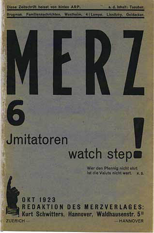
What catch my interest is also Schwitters contribution in commercial advertising and graphic design. A majority of his work with graphic and typography can be seen in the printed version of MERZ (see fig 2). Schwitter says that MERZ had the meaning of building new art from the ruins of the old art, and he uses this term on all his abstract creations which he created out of already existing material he found superficial in the nature (things that other might have considered as rubbish) (Schwitters and Orchard, 2009).

Schwitter was a good friend of the well-known constructivist El Lissitzky, and it is possible to find elements of constructivism in some of Schwitters abstract (e. g fig 3) work (Schwitters and Orchard, 2009)  as well as he [Schwitters] also included some of Lissentzky’s work in his printed version of MERZ (see fig 4).

Fig 1

Fig 2 Merz 6 (1923) by Kurt Scwitters

Fig. 2

Fig 3 Mz 601 (1923) by Kurt Schwitters

Fig 4 Merz No. 6, El Lissitzky contribution.

His interest for constructivism can also be seen in an advert Schwitters made for Pelican inc (see fig 5). However, later this particular work has been criticised for it lack of relevance for what it shall represent – as the aim of any advert is to increase value and attention to a product or case. Even it is a simple abstract design it is complicated to make any immediate link between the given design and the product to promote (in this case Pelican ink) (Frascara, 1988).

Fig 5 Pages from Merz 11, 1924. Advert for Pelican Inc made by Schwitters.

On the other hand, Schwitters got some more accreditation for his typography design. As described in the text «Kurt Schwitters: A Portrait from Life» written by Kate Steiniz (1975), his typography was successful in terms of showing both clarity and logical order as well as «there were emphasis on horizontal and vertical asymmetrical arrangements in blocks and balance of black and white plans» (p.205).

Literature:

Frascara, J. (1988). Graphic Design: Fine Art or Social Science?. Design Issues, 5(1), p.18.

Schwitters, K. and Orchard, K. (2009). Schwitters in Norway. Ostfildern: Hatje/Cantz.

Steiniz, K (1975). Kurt Schwitters: A Portrait from Life. Comparative Literature Studies 12 (3) p.199-217

Online Sources:

Design is History (2009) Available at: http://www.designishistory.com/1920/kurt-schwitters/ (Assessed on 24.11.2014).

Picture gallery 1 Searching for Schwitter in my local library  – (© 2014- Lykkefugl private photo).

Figure 1Scwitters son Ernst outside the stone cottage at Hjertøya, Molde (1934). At: http://www.merzbarn.net/hjertoyamerzbau.html (Accessed on 24.11.2014).

Figure 2: Schwitters, K. Merz 6 (1923) [Magasine cover illustration] At: http://sdrc.lib.uiowa.edu/dada/merz/6/pages/00cover.htm (Accessed on 24.11.2014).

Figure 3: Schwitters, K. Mz 601 (1923) At: http://dailyserving.com/2011/08/kurt-schwitters-color-and-collage-at-the-berkeley-art-museum/ Copyrighted (ARS), New York / VG Bild-Kunst, Bonn (Accessed on 24.11.2014).

Figure 4: Schwitters, K./Lissitzky, E. (1923) Merz No. 6 page 57 [Magasine] At: http://sdrc.lib.uiowa.edu/dada/merz/6/pages/57.htm (Accessed on 24.11.2014 ).

Figure 5: Schwitters, K.  Pelican Inc (1924) [Advert] At: http://havingalookathistoryofgraphicdesign.blogspot.no/2012/11/dadaism.html (Accessed on 24.11.2014).
Looking for ABSTRACT GRAPHIC ART (1)

Stikkord

, ,

To find inspiration for my Practice 1 work I have during the last month used the time to do as much research as I possibly can on the word abstract. I have had my eyes open to catch an interesting abstract design. So did it happen that I ordered some tickets for a ballet show by visiting this online site http://www.billettservice.com.

Website for buying tickets

Fig 1 Screen shot from Billettservice (Norwegian online portal for buying concert tickets).

The colourful background design immediately catched my interest because it reminded me very much of the style painted by one of the Swiss Style pioneers, Max Bill (see fig 2). Bill was a painter, architect, sculptor, editor and politician (Arntson, 2011). In his opinion it was possible to «develop an art largely on the basis of mathematical thinking» (Quote from Max Bill’s writing 1949, Typographic Communications Today (1989) cited in Elam (2001) p.5) (see fig 2 example of art work by Bill).

conceived for the book "San Lazzaro et ses amis".

Fig 2  «A San Lazzaro» (1975) by Max Bill ©2014 Col-lecciò Gelonch Viladegut

Eventually I received the tickets in the post, and as you can see in the attached picture gallery below, the same abstract design was included in every single printed part of the papers I received. I think this is a great example of how abstract art work can work as a perfect page filler as well as it makes a great branding for Billettservice.

References:

Elam, K (2001) Geometry of Design: Studies in Proportion and Composition, Princeton Architectural Press

Arntson, A (2011) Graphic Design Basics, 6 th ed. Boston: Carl Baxter

Figure 1: Billettservice [Website/online portal for buying tickets online] Screen shot from 09.11.2014 (Acessed on 09.11.2014).

Figure 2: Bill, M. (1975) A San Lazzaro [Lithography] At: http://www.gelonchviladegut.com/fr/obras/san-lazzaro-et-ses-amis-libro-2/ (Acessed on 09.11.2014).

Picture Gallery1 Private scanned documents ©2014 Lykkefugl

ABSTRACT – Keyword definition

Stikkord

,

Artwork by Lykkefugl

Fig 1: Definition of my keyword «Abstract»

Based on my interest in creating any Graphic Art using abstract expressions – ABSTRACT naturally became my keyword for the Practice 1 module. I have now found many examples of graphic designers that have abstract paintings/drawings or computer made graphics as the main base for their design. Also, I must admit, I have found quite a large range and variety in my search so far, and many of them very inspirational! So as I go along with my Practice 1 work, I pick out a few graphic artists, show examples of their work and post other things that might be of interest to know about them (how they work/worked, what inspire/inspired them in their work and in which context they operate/operated). I will also try to incorporate contemporary elements to my blog by having my eyes open for various abstract graphic design that would appear around me and put it in an own category which I will call «News».

References:

Online Sources:

Oxford Dictionaries [online] At: http://www.oxforddictionaries.com/ (Acessed on 26.10, 2014).

Image Sourcs:

Figure 1: «Abstract decoration» by Lykkefugl (2014) Definition found in Oxford Dictionaries

Norway got new banknotes, including a colorfully pixelated reverse by Snohetta Design

Stikkord

, , ,

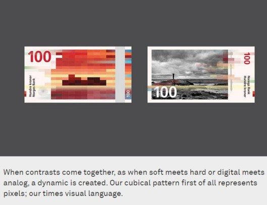
Fig 1: The winning Norwegian bank-note design (2014) by Snøhetta

What has been the hottest news in Norway this week – is the launch of the new graphics on the NORWEGIAN BANKNOTES (see picture above). The theme set out by Norges Bank (the central bank of Norway) was «the sea». Snøhetta graphics and the Oslo based design company Metric systems won the competition among eight other suggestions (click here to see the entrants) (Norges Bank, 2014). By browsing through the entrants you can see how the different graphic artists approached it. The interest organisation for visual communication in Norway, Grafill, has now opened an exhibition showing all designs from the 8 contributors at their gallery in Oslo (exhibition runs until 26th october). Among the finalists, Sinead Moore at money.aol.co.uk, particularly picked out one design that catched her eye; The one created by Aslak Gurholt Rønsen were he had used children drawings on the reverse side of the bank notes (Moore, 2014). I think it was a clever idea, often for people money is an issue (being shortened of money) – I think by having children drawings on it, it makes money a little more informal. As well as it would have a positive effect on those who have a lot of money (and for whatever reason have forgotten to smile). This design could make everyone happy – rich or poor. In the time we live we are all dependent on money in a way or another. In my opinion this was the most radical contribution (see image below).

Fig 2: Alternative Bank note design (2014) by Aslak Gurholt Rønsen

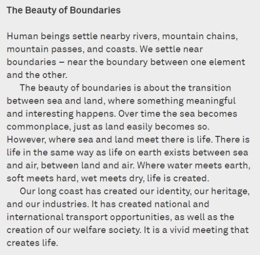
THIS IS WHAT SNØHETTA SAYS ABOUT THEIR WINNING DESIGN:

Image from Snohetta.com

Fig 3: Print screen from Snohetta.com (2014).

ScreenHunter_53 Oct. 12 14.30

Fig 4: Print screen from Snohetta.com (2014).

As the banknotes function is also to be our Country’s visit card and the graphic design aim to represent the whole population, it has of course been of interest to discuss the actual outcome of it. Some like it and some not. I think the final result became both modern and traditional at the same time. The design has also attracted foreign magazines and newspapers to write their opinions on it (I’ve listed a few links below):

Dezeen Magazine
CreativeReview.co.uk
ABC NEWS
The Atlantic
Gizmodo
CNN

References:

Online sources:

Grafill (Norwegian association for visual art) 2014. [home page] Available at: http://www.grafill.no/nyhet/norges-nye-seddelserie-havet (Accessed on 03.01.2015).

Moore, S. (2014) [Online article published on Oct 11, 2014 in MONEY AOL] Available at: http://money.aol.co.uk/2014/10/11/what-banknotes-would-look-like-if-kids-designed-them/#!slide=aol_3011970 (Accessed on 03.01.2015)

Norges Bank (2014) [Home page] Available at: http://www.norges-bank.no/Upload/Images/Sedler_mynter/nyseddelserie/konkurranse/Norges-Nye-Seddelserie-Havet.pdf (Accessed on 03.01.2015).

Snohetta Brand Design (2014) [Home page] Available at: http://snohetta.com/project/200-norways-new-banknotes (Accessed on 03.01.2015).

Image sources:

Figure 1: Snøhetta design and Metric Systems (2014) The winning Bank note design. [Graphic Design] At: http://www.norges-bank.no/Upload/Images/Sedler_mynter/nyseddelserie/konkurranse/Norges-Nye-Seddelserie-Havet.pdf (Accessed on 03.01.2015).

Figure 2: Rønsen, AG (2014) Alternative Bank note design. [Graphic Design] At: http://www.norges-bank.no/Upload/Images/Sedler_mynter/nyseddelserie/konkurranse/Norges-Nye-Seddelserie-Havet.pdf (Accessed on 03.01.2015).

Figure 3: Snohetta Brand Design and Metric Systems (2014) Norway’s New Banknotes [Print Screen of image and text] At: http://snohetta.com/project/200-norways-new-banknotes (Accessed on 03.01.2015).

Figure 4: Snohetta Brand Design and Metric Systems (2014) Norway’s New Banknotes – the Beauty of Boundaries [Print Screen of text] At: http://snohetta.com/project/200-norways-new-banknotes (Accessed on 03.01.2015).

Nächste Halteställe: Berlin!

Stikkord

, , , ,

Welcome to Berlin

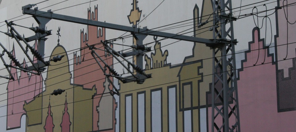
Fig 1 At Berlin Hauptbahnhof ©Lykkefugl 2014

At the same week as I started on my MA in Graphic Design I visited Berlin… The main purpose of the visit was to go to a concert at a place called N.K http://www.nkprojekt.de/ where the swedish music technician and visual artist Fredrik Olofsson held a concert (live electronics music with graphic art visuals). It was very interesting to see how simple elements gradually turned into recognisable patterns. The below gallery shows how straight lines becomes a star (screenshots taken from a youtube video made by Fredrik Olafsson).

So after coming home and «back to school» – reading and getting into the mind-set of Graphic Design again, I quickly browsed through the pictures I had on my camera… And then I found this picture of this BAUHAUS inspired painting of Berlin (where the most famous buildings in the city are reduced to its most elemental forms). In real most of these buildings were placed in long distances from each other  – here they were all colorfully squeezed together in one wall. I really fell in love with this painted brick wall ♡ it would make a great printed postcard from Berlin!

PS! When I came home from my inspirational trip I just discovered this interesting webpage, the home page of The Bauhaus Dessau Foundation, which is the center for collecting and conserving previous Bauhaus design. It also works as a current design research and education center, which in a way nurtures the Bauhaus style to stay alive. I would love to visit the place one day. But for now – I have to say «Auf Wiedersehen» – I left Berlin with lots of great pictures and inspiration.

Graphic Art in Berlin

Fig 3 At Sayvignon Platz ©Lykkefugl 2014

References:

Internet sources:

The Bauhaus, Dessau (2014) [Home page] Available from: http://www.bauhaus-dessau.de/english/home.html (Accessed on 03.01.2015).

Image sources:

Figure 1: Berlin Hauptbahnhof (2014) [Photo] Lykkefugl private archive.

Figure 2: Olafsson, F (2009) Sounding December [Screen shot from video] Video available at:  https://www.youtube.com/watch?v=llzK1bawsX4 (Accessed on 10.10.2014).
Figure 3: Sayvignon Platz (2014) [Photo] Lykkefugl private archive.

My journey continues! You are welcome to follow me on my way…

Hi all, This is the first entry in my blog. I am Lena Nerland – and Lykkefugl is my artist name. I create music and visuals and present them all together, shown on a projector for live music or made together with sound art shown in videos on Vimeo. To create my visuals I use my own abstract paintings and my own printed text (printed on canvas). I further scan this into the computer, reverse it and play with it in MAX/MSP. I have done a variety of graphic art work in the past (see About me) and I believe the research presented in my blog will be of great value to form my future direction. I hope you find INSPIRATION when following me on my journey exploring and reflecting upon GRAPHIC ART & MUSIC. Please feel free to leave any comments.